A Look At OS X Yosemite And iOS 8.1
by Brandon Chester on October 27, 2014 8:00 AM ESTiCloud Drive and Photo Library
At WWDC 2014 Apple introduced a number of significant additions and improvements to their iCloud service for developers and consumers. On the user side we got iCloud Drive and iCloud Photos. Both of these features position themselves against the offerings from other companies in the increasingly competitive cloud storage space. Apple's advantage within their own ecosystem is how iCloud integrates with their own systems better than Dropbox, OneDrive, or Google Drive ever can. Integration cannot keep a service alive if it becomes stagnant though, and these two features are very necessary additions.
iCloud Drive
iCloud Drive is arguably the more important and interesting of the two features. In the past, iCloud has been something like a magic black box that users can never access or even look into. Files would be created in an application, sent to iCloud, and hopefully they would show up on your other devices. This type of model makes for a great document synchronizing solution, but it's not very good at some of the other things people have grown to expect from a cloud storage service. Apple had to build something that allowed users to manage their documents stored in iCloud, including the ability to add or remove files as needed without having to go into each individual iCloud enabled application.
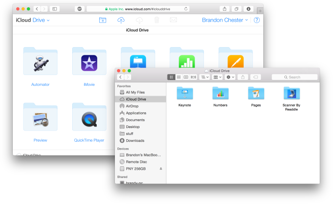
As a file storage service, iCloud Drive functions exactly how you would expect. You can make folders, and upload files to those folders which can be accessed on any other device with access to iCloud drive. In addition to those files, iCloud Drive also houses the files for any iCloud enabled application. As you can see above, each iWork and iLife application also has its files accessible in iCloud Drive, along with third party iCloud enabled apps like Scanner by Readdle.
Your drive can be accessed in a few different ways. In OS X it's integrated right into Finder and is listed in Favorites by default. Windows users can download Apple's iCloud Control Panel to have it accessible via Windows Explorer. I've avoided the Windows solution because my past experience is that having iCloud Control Panel do anything with to Windows Explorer will make it crash Windows Explorer. While I haven't experienced that while using the new Control Panel 4.0 for the purposes of this review, I still don't trust it.
The third method is to access it from iCloud.com. You would think that with these 3 options, including a web based option, Apple would have every platform covered. Unfortunately they don't. There is no way to directly manage iCloud Drive from an iOS device because iCloud.com displays a special page with links to get information on setting up iCloud and installing Find my iPhone. Applications that integrate with iCloud have the ability to open documents stored in iCloud Drive using the document picker, but there's no way to move or delete other files. I don't know if this is just an oversight or if Apple doesn't want it accessible via mobile but it is honestly a necessary feature and I hope to see it added soon either through an app or through iCloud.com on iOS.
iCloud Photos
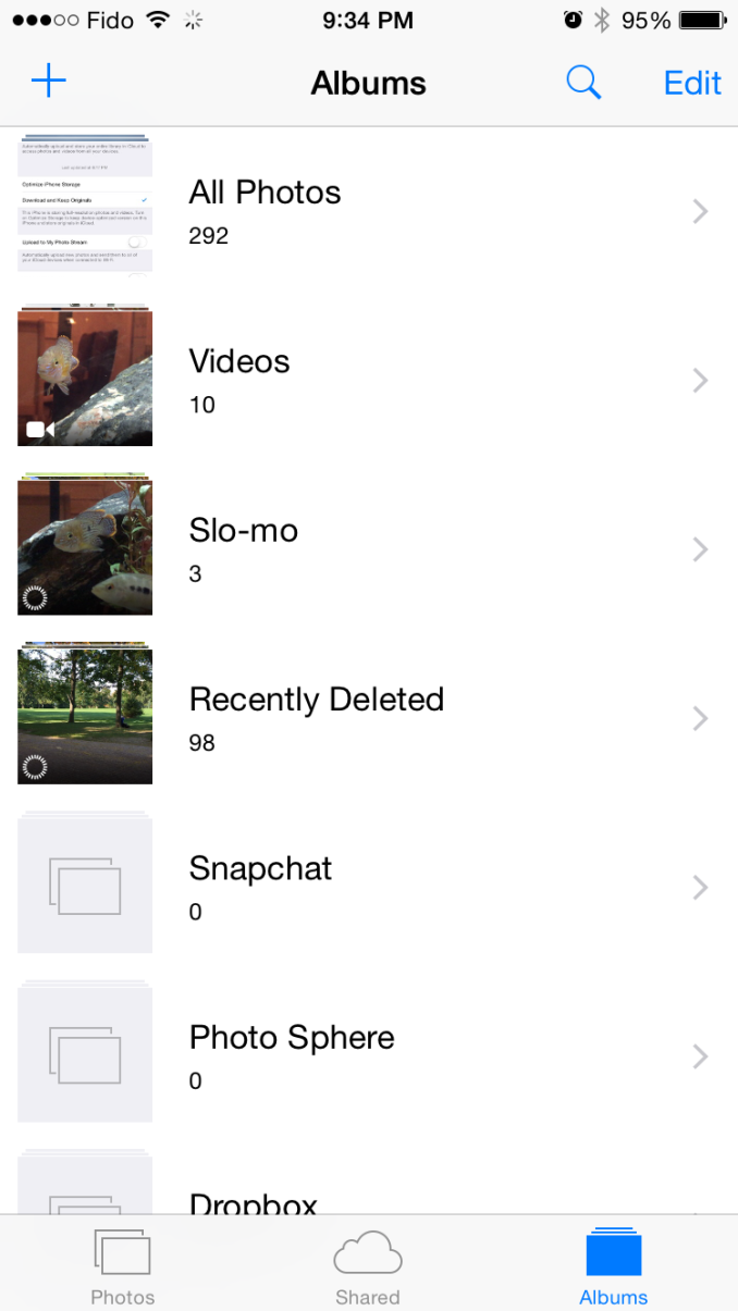
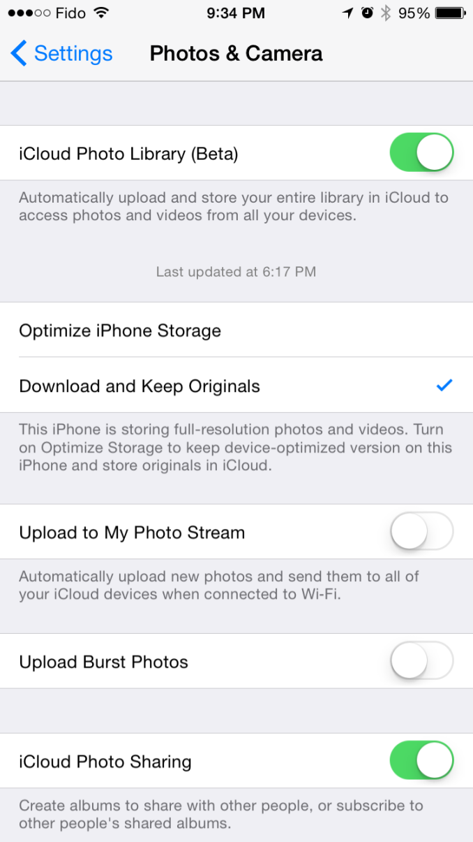
iCloud Photo Library was released with iOS 8.1 in the form of a public beta. I actually wrote about it in my initial iOS 8 review due to confusion regarding its availability. It was only near the end of Apple's beta cycle that they revealed SMS Forwarding and iCloud Photo Library would be arriving with a later release. On top of that, using the OS X Yosemite preview would cause the option to reveal itself on your iOS devices. As a result, my devices running the gold master build still had the feature and I was unaware that for most users it would not be accessible until October. But now October has come and we can take a closer look at iCloud Photo Library in its beta form. Users who want to try it out just need to opt into the beta in the Photos & Camera section of the Settings application. Doing so will change the name of Camera Roll to All Photos in the Photos app.
As I've stated before, iCloud Photo Library is not the same as Photo Stream. Photo Stream is really just a method of pushing your photos between all your devices. It relies entirely on local storage and the photos are removed from iCloud after 30 days. iCloud Photo Library keeps all of your pictures in the cloud, and keeps the most recent and frequently accessed ones locally on your device. This is often referred to as nearline storage. Users can also specify to download copies that are optimized for their display resolution which will save space compared to storing full resolution copies on local storage.
iCloud Photo Library is definitely a great feature, but right now the experience is missing a few key things. On iOS it works very well due to how the entire photo experience is within the Photos application. On OS X it's still lacking. Some people may feel it's unfair to criticize certain aspects due to the fact that the feature is technically a beta, but oversights need to be addressed for them to be fixed.
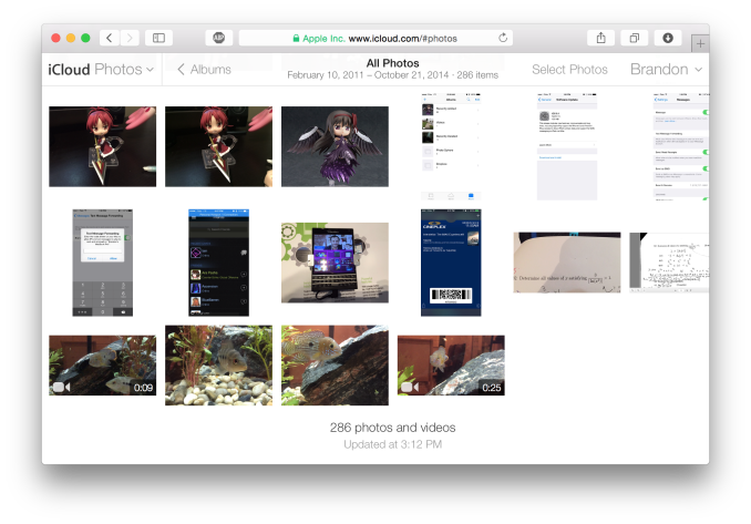
The biggest issue for me is that Apple's Photos application for OS X won't be shipping until early 2015. That's quite a long time after the initial release of Yosemite, and an even longer time after iOS 8 was released. This means that there is currently no way to access photos stored in iCloud on a Mac unless it is done through the web interface. It's an okay solution for now, but the web interface is nothing spectacular. It's essentially the iPad Photos app interface but in a web browser. My biggest issue with it is that it doesn't actually scale. The Safari window with iCloud Photos above is as small as you can make the window without introducing horizontal scrolling. Making the window larger doesn't show more photos on the screen, it just makes the thumbnails bigger. This contrasts with iCloud Drive's web interface which does scale the arrangement of folders based on the size and shape of the window.
There is definitely a lot of pressure involved in trying to ship two major operating system updates around the same time every year, and to pack in new features that work across both of them. Apple made it clear at WWDC 2014 that Photos on OS X wasn't going to be ready until 2015, but I think the issue created by that could have been addressed much better by updating iPhoto to support iCloud Photo Library rather than relying on the web interface.


173 Comments
View All Comments
SirPerro - Monday, October 27, 2014 - link
As a long term OSX power user and a long term Android power user I feel constantly dissapointed by OSX updates.I certainly understand Apple efforts to unify their experiences and make them consistent under the same ecosystem. That's good for their business.
Unfortunately I'm on a situation where OSX for me is more a handicap than something I'd like to pay for, and that's something which is reinforced on every single release.
I fear that after 13 years my current MacBook Pro from 2012 will be my last Apple product. I will not use a system which is focused to my grandma and obfuscates all the advanced features under complex bash commands in an effort to make them not available to the users. I will not buy a 2K laptop with soldered RAM and battery, let alone the stupid joke the new iMac is.
I'm sad, because OS X has been my main driver for some many years. But I'm not buying the Apple ecosystem, and apparently that's all that Apple wants to sell now.
tim851 - Monday, October 27, 2014 - link
What advanced features are obfuscated in 10.10 that weren't in 10.8?And what kind of power user is afraid of bash?
SirPerro - Monday, October 27, 2014 - link
Multi monitor is painful, and basically all the controls other than raising/lowering brightess/volume and activating trackpad gestures are taken as "advance" features and completely obfuscatedI'm not afraid of bash in any way. But there are many things that should have a UI purely for convenience. Apple doesn't build that because they treat their consumers as if they were idiots.
"It simply works" ... "and if not, just go find the solution in stackoverflow because we're not providing that info to you"
blackcrayon - Monday, October 27, 2014 - link
You're not going to disprove statements like "it simply works" by saying things like "multi monitor is painful". HOW exactly? As with Mavericks some people like it better if they turn off "Displays have separate spaces" in the Mission Control system preference. I personally like the new way better, so I'm wondering where the "pain" is.darwinosx - Monday, October 27, 2014 - link
You are "bashing" a product you clearly know nothing about so I really doubt you are an experienced user as pretty much everything you said is wrong. Try Windows or Linux. Bye.techconc - Tuesday, October 28, 2014 - link
When people make vague arguments and are not able to provide specifics, they come off as a troll. I'd like to think this isn't the case, but based on the comments provided, SirPerro is apparently just trolling. That's sad.If there is a specific issue, state your case and others will help you solve your problem. At this point, I doubt there is any such problem to speak of.
JimK85 - Saturday, November 1, 2014 - link
Here are some annoyances in OSX versus windows or Linux:1. Minimal Right-Click Context Menu. More clicking around to do things like simply creating a new folder
2. Wonky max/min window controls. Why cant I just maximize a window with "one" click
3. Far more extensive customization of task bars, toolbars in windows and linux versus the pretty dock and menus in OSX that are mostly "static".
4. Natively having the ability to rename multiple files with ease in windows is pretty handy.
5. Many apps in OSX cant do half screen windows...Why? In the windows/linux world any windowed app can be resized (this was a mistake Microsoft made with windows 8 which they are fixing in Win 10. )
I could go on but this isnt intended to be a bash OSX post. I'm sure we could list things about OSX that cant be done in windows or linux. I just find features I prefer are limited in OSX.
EnzoFX - Saturday, November 1, 2014 - link
1. Minimal? Apps can enhance right-click just as they do with Windows. Furthermore, what about shortcuts? I find OS X's shortcuts way more intuitive. I rarely use right-click because I can do most things with one click or a shortcut.2. Wonky? You clearly don't understand the intent of the "maximize" button, nevertheless if it's not for you, I can get that. But I wouldn't call it a con right away.
3. Uhm there are just as many apps that enhance the dock and menubar. I'd argue better ones over Win.
4. Renaming multiple files? Are you kidding me? OS X does this too you know.
I'm just gonna stop, you clearly haven't used the OS enough.
JimK85 - Sunday, November 2, 2014 - link
Some of these things are not native in OSX. You have to do it with a batch file or get an add on.osxandwindows - Wednesday, October 7, 2015 - link
I had all of this things sense OS X 10.6