Apple's MacBook Pro: Using it as a Mac and a PC
by Anand Lal Shimpi on April 13, 2006 12:00 AM EST- Posted in
- Mac
The MacBook Pro: So very similar, yet so very different
When Apple first announced that it had accelerated the introduction of the Intel based Macs and introduced the iMac Core Duo and MacBook Pro, I was not impressed. Maybe it was that my expectations were too high, but for Apple's first attempt at an Intel based Mac I expected a design that would blow me away. I expected the reaction to the Mac mini, but with even more punch, yet all I got were brand new internals in the same old exterior.
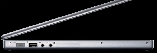
Compared to the G5, the new Core Duo processors were significantly less power hungry. As I showed in my iMac Core Duo review, you're looking at about 2/3 of the power consumption of the G5 yet the new CPUs were kept in the same chassis. For the MacBook Pro I expected something that was thinner than ever before, I expected Apple to virtually defy the laws of notebook making and truly deliver the most amazing thing I had ever seen running an Intel processor. Instead, Apple introduced something that looked very similar to my PowerBook G4 - but with a new power connector.
Part of the problem is that it took several weeks after the first announcement of the MacBook Pro for units to even be available to the public. At launch you couldn't go out and actually play with one of the new systems at an Apple store. I state this as a problem because after actually handling a MacBook Pro, the individually small improvements are pretty nice in the aggregate.
Compared to my 15" PowerBook G4 the 15" MacBook Pro is ever so slightly thinner; my PowerBook measured 1.1" in thickness and the new MacBook Pro is an even 1". Apple actually made the MacBook Pro slightly larger than its predecessor at 14.1" x 9.6" vs. 13.7" x 9.5" of the older PowerBook G4, but by making the unit slightly thinner and longer/wider the MacBook Pro actually ends up feeling a lot smaller than its predecessor. The slim theme continues even to Apple's packaging, as the MacBook Pro comes in a fairly thin (for a notebook) box. Much of the impact is psychological, but the MacBook Pro honestly does feel smaller than its predecessor despite being larger in two of its three dimensions. After putting the MacBook Pro in the same place on my desk that my PowerBook G4 used to sit, though, the MacBook Pro is definitely bigger.
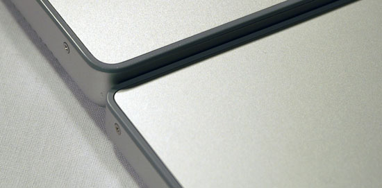
PowerBook G4 (top) vs. MacBook Pro (bottom)
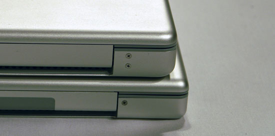
PowerBook G4 (top) vs. MacBook Pro (bottom)
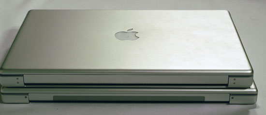
PowerBook G4 (top) vs. MacBook Pro (bottom)
One of my first complaints about the PowerBook G4 was that the latch that kept the display lid closed felt like it would be the first thing to break. Thankfully it never has, but it never made me feel comfortable. On the MacBook Pro, Apple addressed the issue and replaced the single latch with a pair of latches. They are still controlled by the single button at the front of the unit but the end result is a more flush fitting display lid when closed and a much higher quality feel.
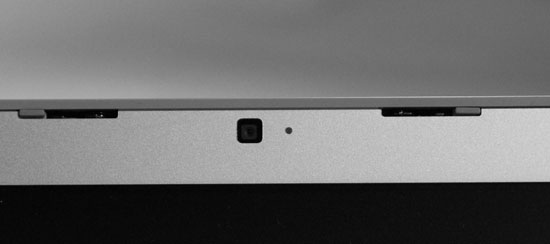
There's one latch on either side of the iSight camera
The construction overall appears to be better than the PowerBook G4, which held up fairly well while being in use for over a year. Unfortunately, the MacBook Pro does have a couple of assembly related issues, both of which are visible on the keyboard itself. A few of the keys squeak a lot when depressed, mainly the spacebar. More bothersome is the fact that two keys are poorly mounted. The eject button is by far the worst on the unit I'm reviewing as removing the key and replacing it doesn't actually put it back in line with the rest of the function keys. The only solution for this problem is to take it back to Apple.
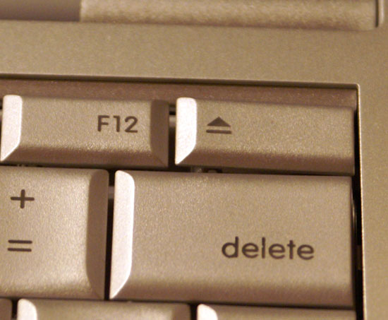
The eject key looks like it's not set properly, but there's no fixing it. Apple quality control at its best.


52 Comments
View All Comments
user31415 - Monday, September 26, 2016 - link
What are the unities of the 0.3 performance per Watt (please mention is on your article)user31415 - Monday, September 26, 2016 - link
*unity